How to Use Pastel Colors for Your Design & Outfit in 2026
Something about pastel colors sparks joy and contentment, like feeling the sun on your face and the sound of the waves kissing the shore. There’s a time and a place for boldness, but soft and stunning pastels aren’t just for bridal shower themes or baby shower themes anymore.
From mainstream fashion to logo design or at-home art projects, pastel colors are providing a much-needed sense of relaxation to our world. Colors can truly impact your mood, according to Verywell Mind. That means it’s important to choose wisely when you’re painting a new room or considering how you want guests to feel at a color-coded event.
These muted shades aren’t just for Spring – they make a subtle yet pleasing tone for your bedroom or bathroom and add a laid-back vibe to your summer parties. For branding, you can stand out in a world of dark hues by adding pastel colors to your Instagram images or logo.
The range of pastel color shades is as versatile as the rainbow of bold colors, and these soft hues add amazing dimension to your outfits or designs.
Jump to Section
- What are Pastel Colors?
- Top Pastel Color Palettes
- Tips for Using Pastel Colors
- Best Color Palette Generators
- Pastel Color Palette FAQs
What are Pastel Colors?
Chances are good you recognize a pastel color when you see it, but speaking by definition, they are a tint of color that has white added to it. That means if you’re working with a palette of true colors, you need only stir in some white to find the pastel shade. Mint green and baby blue are popular, but pleasing shades of lavender or creamy orange are sure to catch your eye.
You won’t find pastels on your classic color wheel because they don’t fall into primary, secondary or tertiary colors. What are true pastel colors? Typically, shades of soft pink, blue, green, yellow and purple. You can turn pretty much any color into a pastel color by mixing it with white to produce a softer shade.
What is a pastel versus a pale color? They’re pretty much the same thing — pale colors are pastels, but not all pastels are pale. For example, you can mix fuchsia pink with white to produce blush pink and have it still maintain a fairly strong hue.

Top Pastel Color Palettes
Best Pastel Colors for Photos
Pastels colors look even more dreamy next to bolder, darker colors, especially through the lens of a camera. To best capture these soft shades, direct (but filtered) sunlight will cast the best lighting. Think of a slightly overcast but still bright day to make the pastel colors pop. Adjusting the exposure on your camera and editing the lighting afterward can ensure a stunning pastel color photo.
Hosting a party with a theme always makes things memorable and it’s a great opportunity for some nice photos. Rainbow party ideas done in a pastel palette feel elegant and dainty, as opposed to circus-like. There are plenty of theme party ideas for wedding showers, baby showers or birthdays that can be elevated with a pastel color scheme.

Best Pastel Colors for Logos & Brands
There are plenty of strong pastel color examples in branding to inspire you. But it all depends on what you’re selling of course.
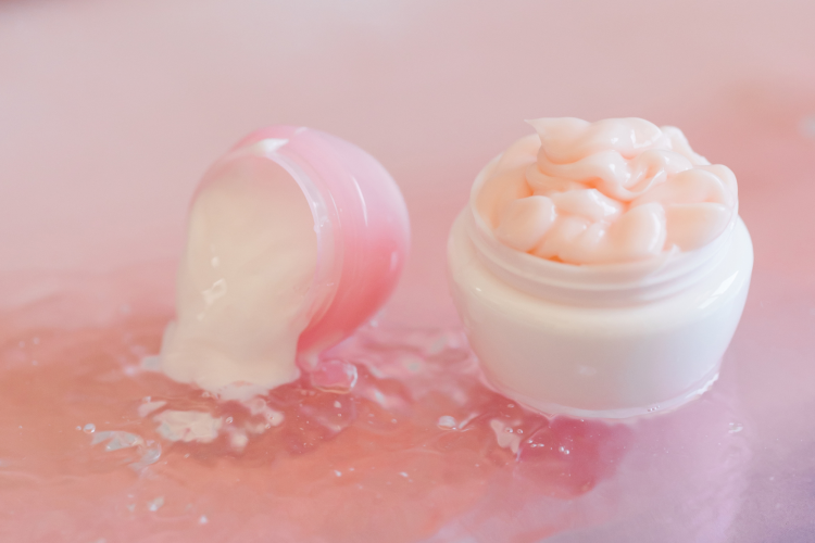
Soothing skincare products can lean on cool pastel colors in their product photos and labeling to represent the product before a consumer can even read the label.
Pairing pastel colors with a bolder hue makes a product label or advertisement extra eye-catching and adds great depth. Think shades of coral paired with muted dusty rose or teal paired with soft pink or lavender.
Choose your brand colors for a color party idea to celebrate a launch or work anniversary that has an easy and fun theme.
Best Pastel Colors for Instagram
Pastel colors have been a big part of the world of social media for a while now, and there’s no signs of that trend changing.
Some of the most popular pastel colors you’ll see on the Gram include millennial pink, baby blue, mauve, peach and soft, pale yellow. Try combining these pastel colors with other pastels or a bold hue, as described above, for a memorable graphic or story.
Best Pastel Colors for Drawing & Digital Art
It depends on what you're drawing or creating, and choosing the right pastel colors for your brand or theme is important. Start with a pastel color box that includes many shades and play around with mixing to find your favorites.
Just like with branding, mixing pastel shades with bold options creates a wonderful dimension and is pleasing to the eye. Using pastel color backgrounds creates a soft canvas for more vibrant hues up front and is a nice change from just plain white.
Pastel color drawings with an oil-based medium will provide more coverage and deeper color than watercolors, but it’s fully a matter of preference.

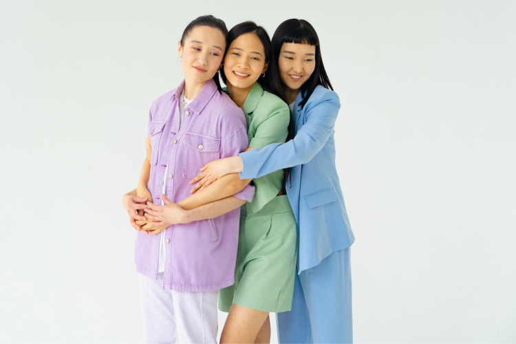
Best Pastel Color Dresses for Girls Night
Shades of pink are the go-to for girl-themed parties, from a soft pink Barbie theme party to a gender reveal for baby girl. Even just a night out on the town with everyone decked out in pale pink makes for a fun photo op.
Want to steer clear of pink? Super-soft lavender is feminine and light, a gorgeous pastel color for a group of girls. Even better, this color is perfect for your Valentine's nails, especially if you're someone who typically avoids the traditional pink.
For the right occasion, pastel color dresses or pastel color sarees can be just as stunning as bold primary colors, especially with a nice tan. You can even host a rosé party with pink wine, pink outfits and pink tablescapes.
Best Pastel Color Shirts for All Seasons
Some pastel colors are more universally flattering than others. A lot of people find that seafoam green or pale yellow washes out their complexion.
Instead, opt for shades like a soft orange or cornflower blue that you can wear even in the Fall or Winter. Which pastel color shirts or sweaters best complement you will depend on your complexion.

Tips for Using Pastel Colors
Depending on where and how you want to best showcase your pastel colors, there are some tips to help them shine.
With advertising and branding, be aware that colors have a psychological impact and you can use that to your advantage with pale shades and soothing tones. Be sure to choose pastel colors that align with your brand, not just shades that catch your eye. When it comes to art and painting with pastels, make sure to use a soft background so the delicate hues will show up.
Pairing a pastel color with a color opposite its true shade on the color wheel makes it pop. For example, blue and orange sit across from one another on a color wheel, so if you’re using a shade of pastel orange, pair it with bright blue for maximum effect.
You can still create stunning visuals by pairing pastel colors with more pastel colors, depending on the effect you’re going for. Keep in mind that certain pastel color palette combinations can feel a bit dated, like using baby blue and baby pink together can make your design look like it belongs in an old nursery.
Adding metallic accents with pastel colors really takes your look or design to the next level.

Best Color Palette Generators
There are several free pastel color generators out there to inspire you. Sites like Coolors and VistaCreate have pre-selected pastel color palettes for you to consider, but you can always customize. Other visual design tools like Canva can help with this too.
Pastel Color Palette FAQs
Are Pastel Colors Warm or Cool?
Neither and both! The category of pastel colors isn’t inherently cool-toned just because it’s softer or mixed with white.
Your choice of pastel impacts whether it’s perceived as warmer or cooler. Softer shades of orange are warmer than a soft shade of blue, for example.

What Effects do Pastel Colors Have on an Audience?
As mentioned above, color choice has a psychological impact on your audience. This can work in your favor, especially with advertising.
Apart from the subject matter or logo, choosing pastel colors can be relaxing and inspire joy. Often these muted hues bring a sense of romance to an image, and they can make things feel extra elegant.
How Can You Use Pastel Colors?
Just the same way you’d use any other color. Bolder isn’t always better, especially when it comes to branding and advertising. Consider the above psychological effects of using pastel colors when making graphic designs or a new logo or business card.
If you’re into art, making a pastel oil or watercolor piece is a lovely accent for your home, especially in a space where you want to feel relaxed like a bathroom or bedroom.
What is the Most Popular Pastel Color?
There isn’t a simple answer for the most popular pastel color, but a few of the most well-loved and popular shades include lilac, mint, baby pink or blue, peach and mauve. Think of cotton candy skies in the summertime.

What are the Benefits of a Pastel Color Palette?
Apart from being pretty to look at, they can boost your mood and soothe your eyes. Pastels are versatile in both usage and combination. Plus, they can add a contemporary feel to your photography or business site. They tend to make people think of Spring or Summer, so dressing in pastels will feel very seasonally appropriate and feminine in all the right ways.
The world of pastel colors is modern, sophisticated and visually appealing whether you’re talking about fashion, art or branding. Just one look at a soft shade like a Summer sunset sky or a pale purple flower and you’ll understand.
These shades will calm and uplift you at the same time, bringing out positive feelings and a sense of peace whether you’re creating graphic designs for Instagram or planning the perfect party.
For even more fun party ideas, check out other experiences happening on Classpop!